
I could see the sky. That was remarkable because I was standing in a hospital hallway; rather than a windowless, fluorescent-lit labyrinth, this third-floor corridor lets me catch a bit of the grey winter sunlight, streaming past the Jacques Cartier Bridge in the distance.
I was in Montreal, at the University of Montreal's new hospital centre (CHUM). The 772-bed complex in the city's downtown opened to patients a few months ago. It is one of the most important works of architecture in the country: The hospital is designed for 800,000 visits a year, and Montrealers will have some of the most intense experiences of their lives here.
Happily, CHUM reflects an increased emphasis, in contemporary hospitals, on what's called " patient-centred design." The central insight is obvious enough: That the design of a place can put people at ease, make them happier and then make them healthier.

The hospital is designed for 800,000 visits a year.
Adrien Williams
"CHUM is a good example of making sure that it's not just the physical care that needs to be provided in the building," argued one of its lead designers,
Azad Chichmanian of Neuf Architectes, "but the spiritual component as well."
Begin with the daylight and views. These commodities have been rare in hospital design for the past three generations. Most of us have shared the experience of being a patient, or visiting one, and getting lost in a windowless maze of low-ceilinged corridors, endless heavy doors, perplexing signage and relentless fluorescent lights.
Not here. The building integrates 13 works of public art, generous gathering spaces and design that attempts – though does not entirely succeed – to link the institution with the surrounding city.
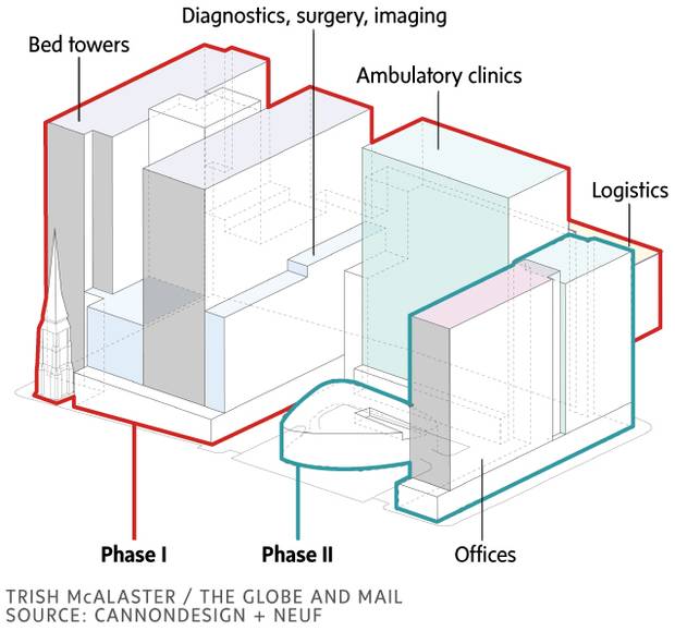
The complex, which has now completed its second of three phases, is a collaboration between architect Jocelyn
Stroupe and her team at the large American firm CannonDesign and Montreal's Neuf. The team strove to make the building serve its human users, working with architectural and medical research. "The design is based on evidence of what works," Stroupe said.
The patient rooms are a case in point. They are all identical in layout, so staff can navigate them effortlessly. A zone near the door includes waste bins and a sink – wash your hands promptly, please. The washroom, to the left, has few seams or horizontal surfaces to accumulate germs. The bed, to the right, is positioned to give the patient views out the window; and a family area, in the far corner, includes a reclining chair and storage cabinet. The materials are utilitarian, but the details are thought out: Most importantly, the patient can control the lighting from the bed, killing the fluorescents when they want to relax. And the monitoring equipment is designed to beep as little as possible. These rooms "give patients control over their own environments," Stroupe said.
While you walk around the halls, you will rarely see linen carts or patients on gurneys. They move through a separate set of staff-only corridors; in yet a third set of spaces, robots pick up and deliver supplies. (They beep politely, and announce their presence en français and, for good measure, in English.)

The hospital's main building is divided – to excellent effect – into three smaller wings. The front door, when the project is complete, will face onto a large courtyard. One wing to the north houses mostly outpatient clinics; two more wings to the west, patient care rooms. "Eventually, when you arrive at the front door and ask for directions,"
Stroupe said, "the staff will be able to direct you with a gesture."
When you get up to your destination, there are limited choices. In the ambulatory wing, where I was admiring the view, there was only one way to walk: around a corner to a waiting area, overlooking what will eventually be a courtyard. (An installation on the glass, by artists Doyon-Rivest, presents a whimsical scattering of words: Étoile. Capucin. Gants.)
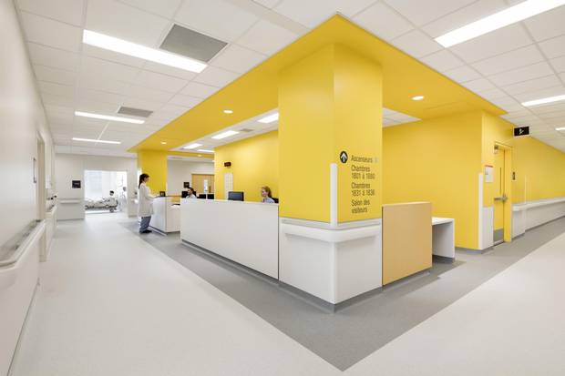
In this space, four thick rectangles protruded across the ceiling, daubed with vivid colours: purple, orange, blue, green. Each marked the way to a reception desk for a specific clinic, whose rooms extended down a hallway beyond. Simple enough. "In general, the architecture does a lot of work in the intuitive wayfinding and prise-en-charge," designer Chichmanian said, "signalling where you need to go. By the time you arrive, there are objects that allow you to create a mental map."

The 772-bed complex in the city’s downtown opened to patients a few months ago.
Adrien Williams
This is only possible because of the hospital's division into wings. That harks back to Victorian and Edwardian buildings, built before mechanical ventilation and electric light, when hospitals had to have windows and cross-breezes to keep people comfortable and to prevent infection.
By contrast, a typical hospital built after 1970 is a tall, fat slab and its floor plan is what architects call a "racetrack": a corridor leads around the outside connecting to patient rooms, while offices, clinics and other space are placed at the interior. That's convenient, in organizing a hospital's complex mechanical systems. It's also soul-destroying. Such hospitals offer little to look at, and nowhere much to linger – at best, from the eighties on, a central atrium, which is a poor substitute for views or fresh air.
And that matters. As Stroupe points out, there is a body of medical research going back more than 30 years that emphasizes the effect of the physical environment on healing. The environmental psychologist Roger Ulrich published a study in Science in 1984 that compared the postsurgical healing of patients who had views of greenery with those who had views of a brick wall. The dose of nature helped the latter heal more quickly, with fewer complications. This sort of insight has informed "patient-centred design."
While you walk around the halls, you will rarely see linen carts or patients on gurneys. They move through a separate set of staff-only corridors.
Adrien Williams
"A lot of these ideas seem obvious: Why wouldn't you do that?"
Stroupe acknowledged. "But if you look at older facilities, they're like factories. It didn't matter what the patient thought; it was all about making the clinical care more efficient. Now, there's a much stronger emphasis on the patient and their family. It's a better balance, I think."
But that was not the only balance that had to be maintained in this project. CHUM, as with most hospitals in Canada today, was built through a highly convoluted bureaucratic process: a public-private partnership in which a consortium takes responsibility for the design, construction, financing and maintenance of the facility for, in this case, 34 years. The number of nouns in that sentence alone suggests the complexity of the deal, and the attendant bureaucracy.
In this sort of process, one set of consultants deals with the building's users to develop the requirements, then another team (here led by Cannon and Neuf) translates those back into a building.

A roof terrace on the eighth floor is pictured.
Adrien Williams
Much can get lost in translation. The design and construction of CHUM lasted for seven years. "The process was long and fraught with peril,"
Chichmanian said.
Stroupe put it somewhat more diplomatically: "We had to hold onto a very clear vision of what we felt the design needed to express," she said, "and continually work on making sure that that happened."
On the small scale, they have succeeded. On the larger scale – how the hospital sits in the city – the results are more mixed. CHUM's presence downtown represents a victory. The amalgamation of local hospitals into CHUM and its English-language counterpart, the McGill University Health Centre, has stretched on for two decades – longer than the Taj Mahal took to build, as The Globe's André Picard pointed out – and CHUM almost wound up in Outremont. Instead, it went downtown next to the aging Saint-Luc hospital. This decision is bringing some investment and jobs to a long-depressed area of downtown, which was gutted by the construction of the Ville-Marie expressway in the early seventies.

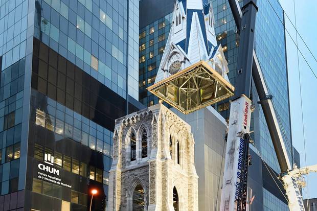
The glass of the atrium encloses two fragments, which Neuf architect Lilia Koleva describes as “found objects”: greystone façades of the 1890 Garth House, and the bell tower of the 1865 Holy Trinity church.
Adrien Williams
It was the right decision to put it here, on the Metro. A hospital spokesperson suggested that a meaningful number of outpatients arrive by transit, and I saw some of them. If governments care at all about building sustainable cities, they will put new hospitals in such locations and not, as Ontario is doing in Windsor, on totally
unwalkable suburban campuses.
The problem: The hospital is huge, and a behemoth on the streetscape. The architects are aware of this and have altered the urban design of the hospital to break it up as much as possible. Along St. Denis Street, the building opens up with a glassy atrium that provides a comfortable waiting space and connects with the adjacent cafeteria. The glass of the atrium encloses two fragments, which Neuf architect Lilia Koleva describes as "found objects": greystone façades of the 1890 Garth House, and the bell tower of the 1865 Holy Trinity church, which houses a sound-art piece. The art is thoughtfully curated and integrated into the building.
Still, from outside, the hospital is a huge battleship-like mass, wrapped in a grey glass curtain wall that is generic and without any sense of place. CHUM looks awfully foreboding, and not at all like it belongs here in the city.
Bigness is a problem here. The most current thinking in hospital design emphasizes connections with landscape, and placing a hospital in conversation with its surroundings – something that CHUM only tries to do with some green roofs and the odd terrace. If our governments are now learning how better to heal our bodies, they should continue working on how to heal our cities.